Brand identity
Buckingham Research, a mid-size, successful consumer products research agency, needed to refresh their brand. We transformed the company image across all deliverables and enabled them to attract higher calibre staff and improve their client roster.
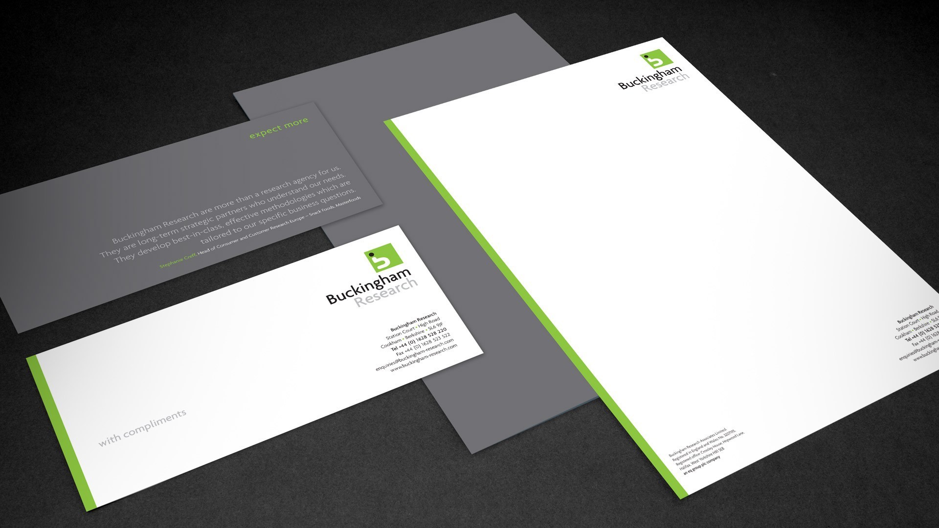
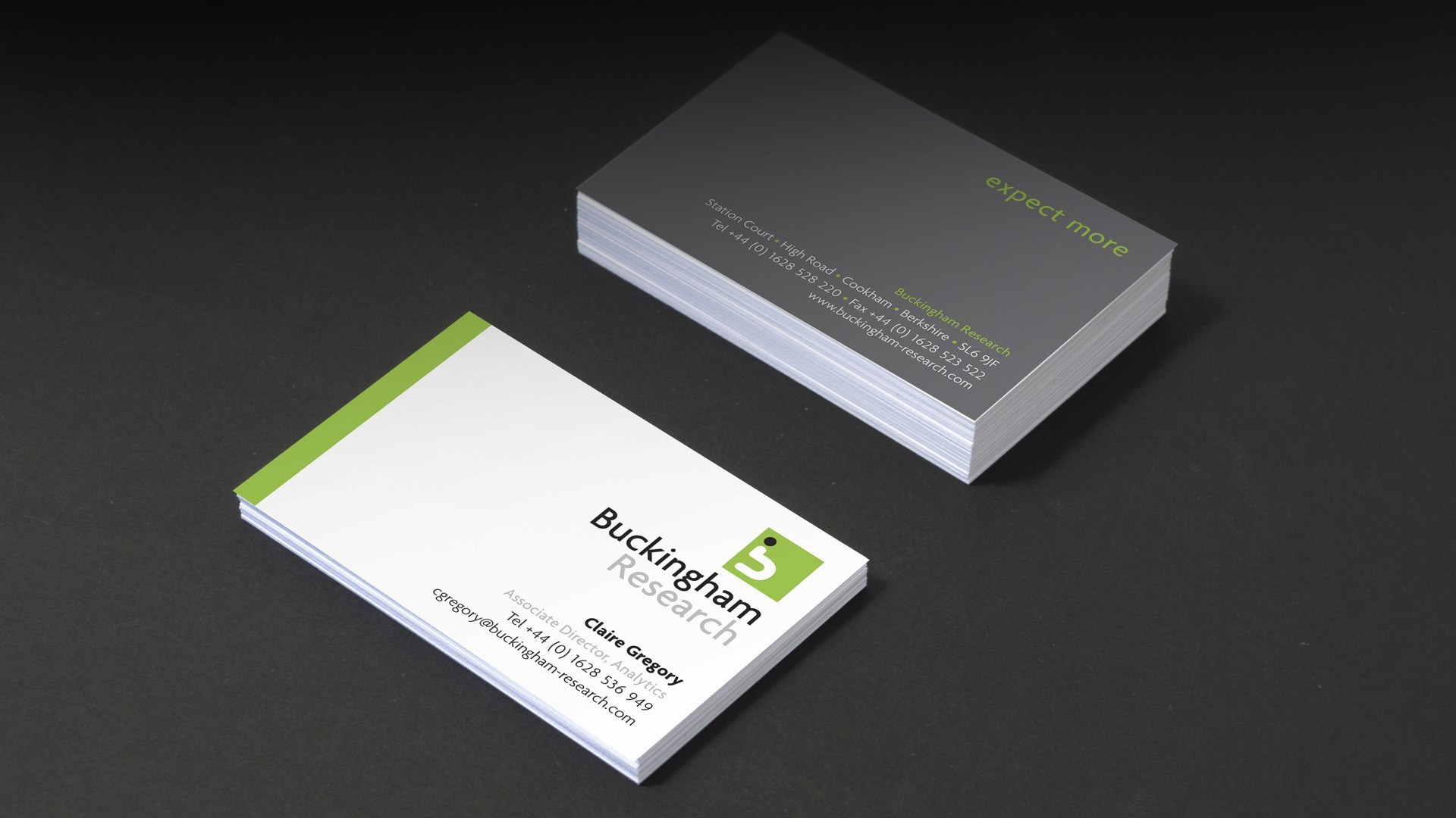
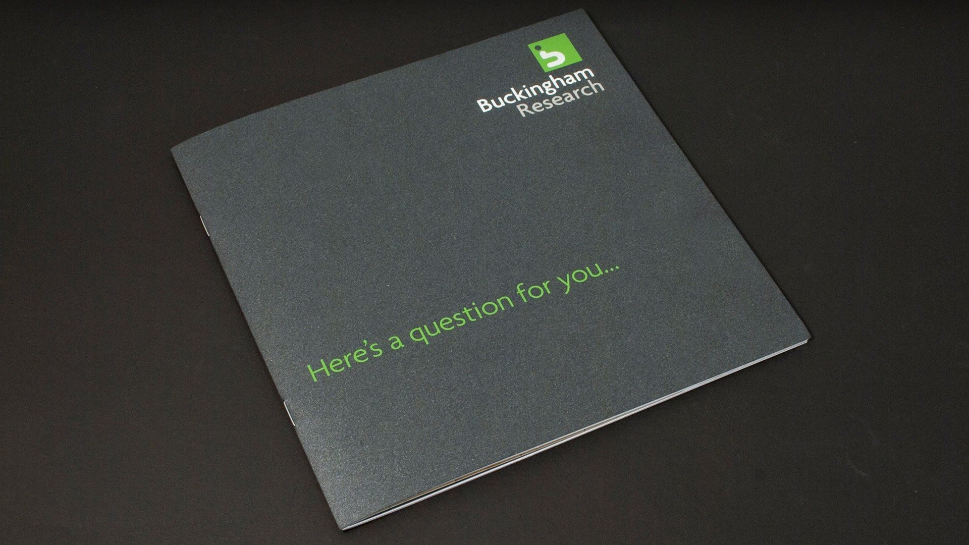
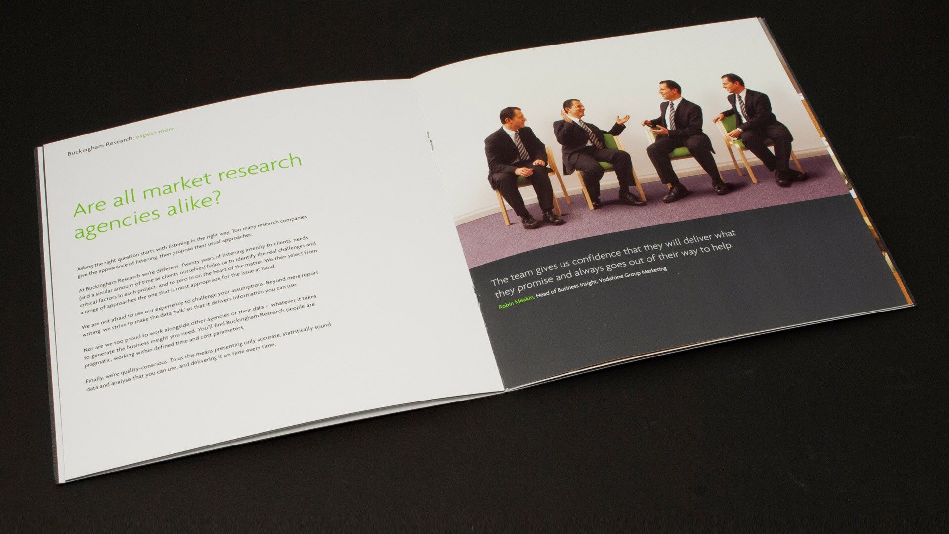
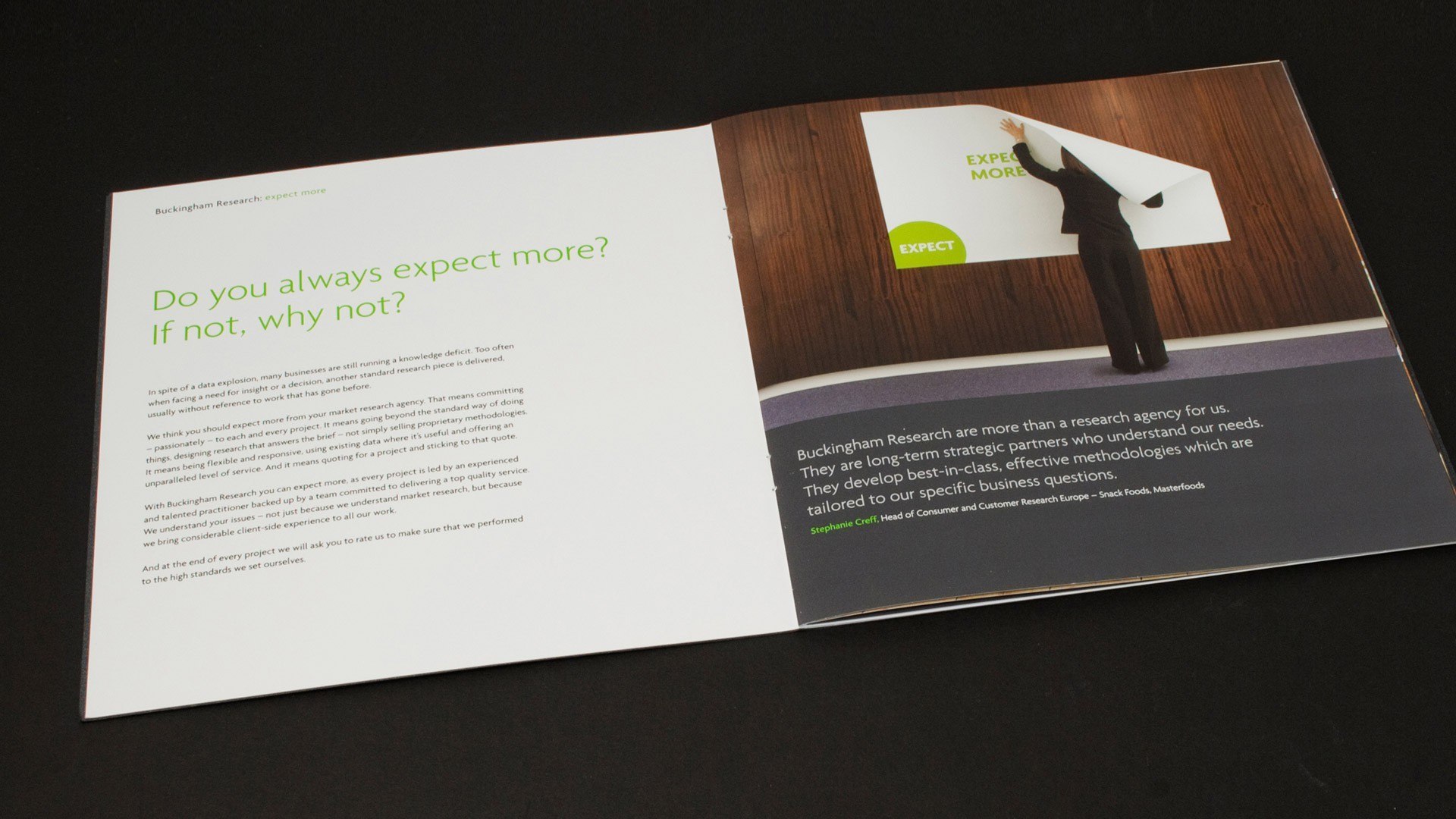
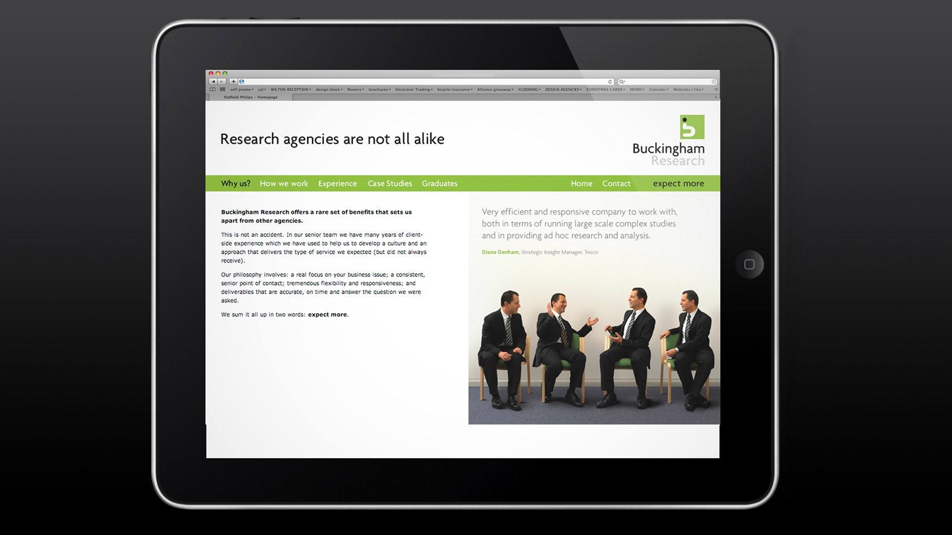
Buckinghams ask questions – lots of them. We emphasised this in the chosen marque that shows the letter “b” made from an inverted question mark. Fresh colour and stylish typography completed the logotype. This identity was continued throughout a range of stationery and presentation materials, including a corporate brochure and website that continued the ‘question’ theme.
And within the brand components, to add ownership to the visual images, Red Door undertook the original photography on-site – a task that included some very game staff members acting out some very interesting scenarios.


