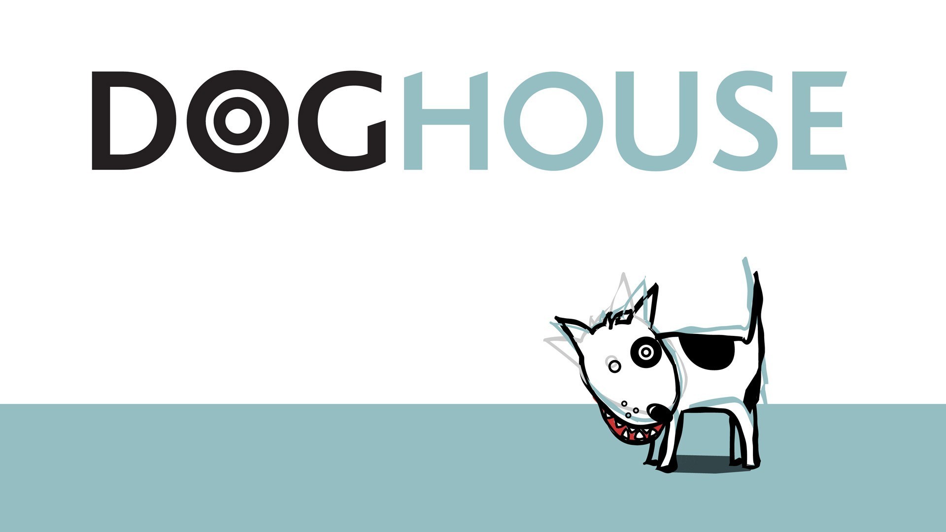
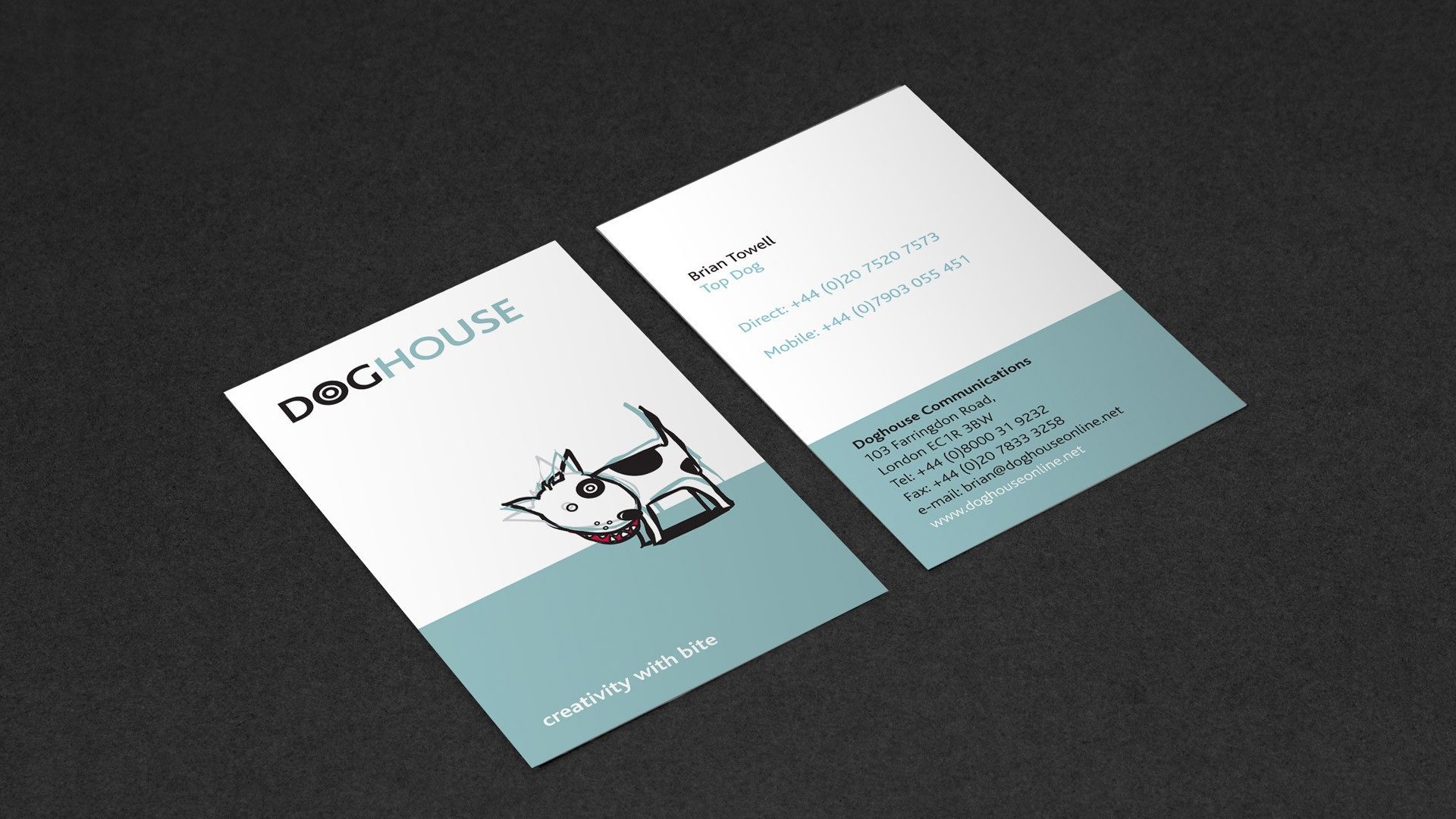
Brand identity
A pharmaceutical branding agency with a difference, Doghouse needed an identity that reflected their irreverent yet positive canine characteristics.
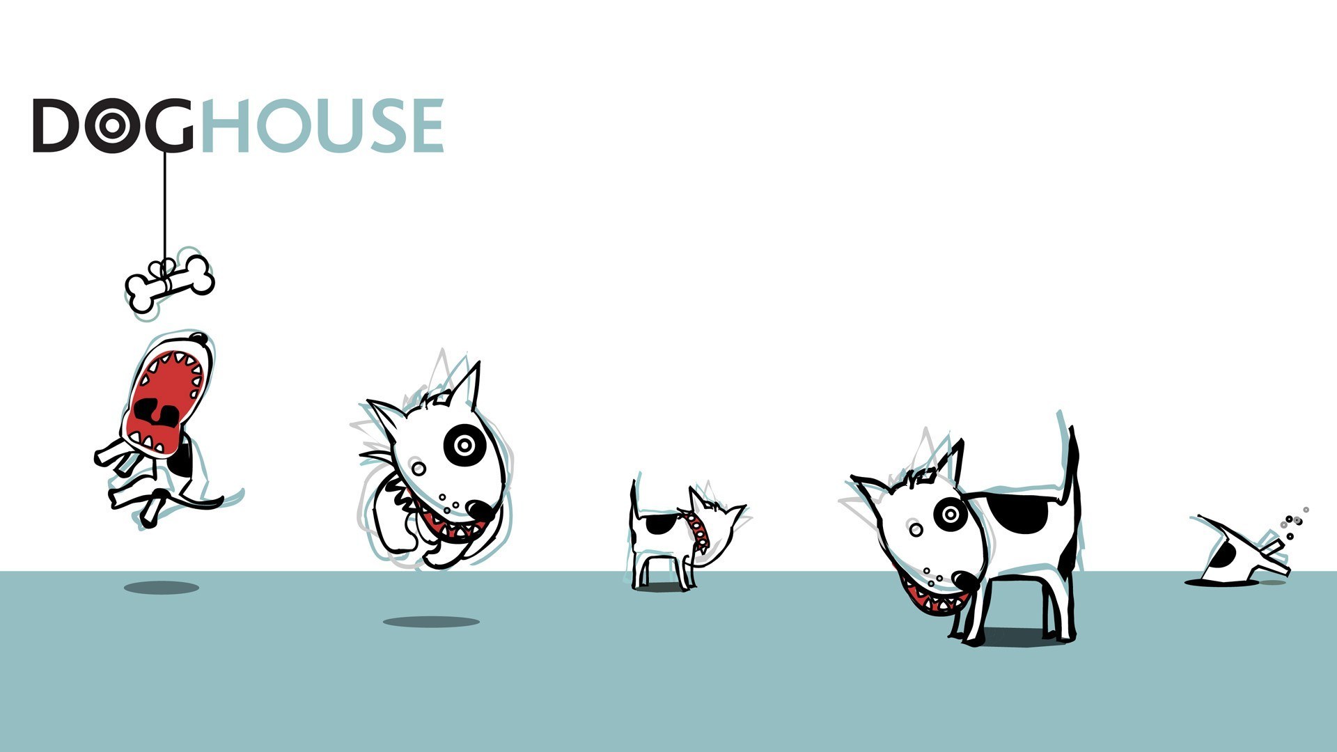
From initial pencil and typographic concepts, Red Door developed ‘Bullseye’, a character that used the ‘o’ roundel from the logotype. This character was to become a supporting Icon for the identity. Rather than being a static Icon, Bullseye appears in various poses, reflecting the personality of the company. Clinical colours were utilised to create a serious pharmaceutical base for other visual matter.
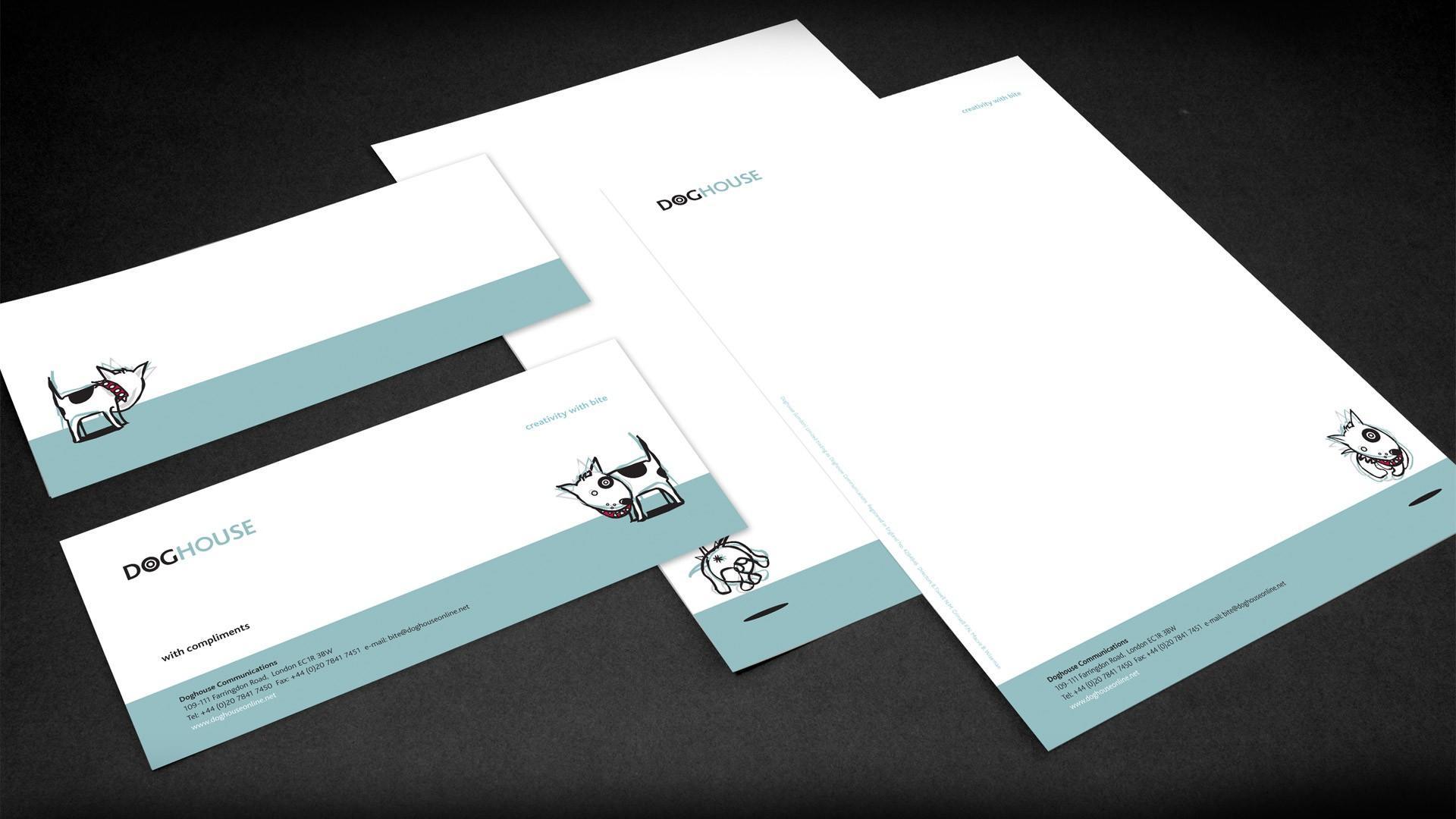
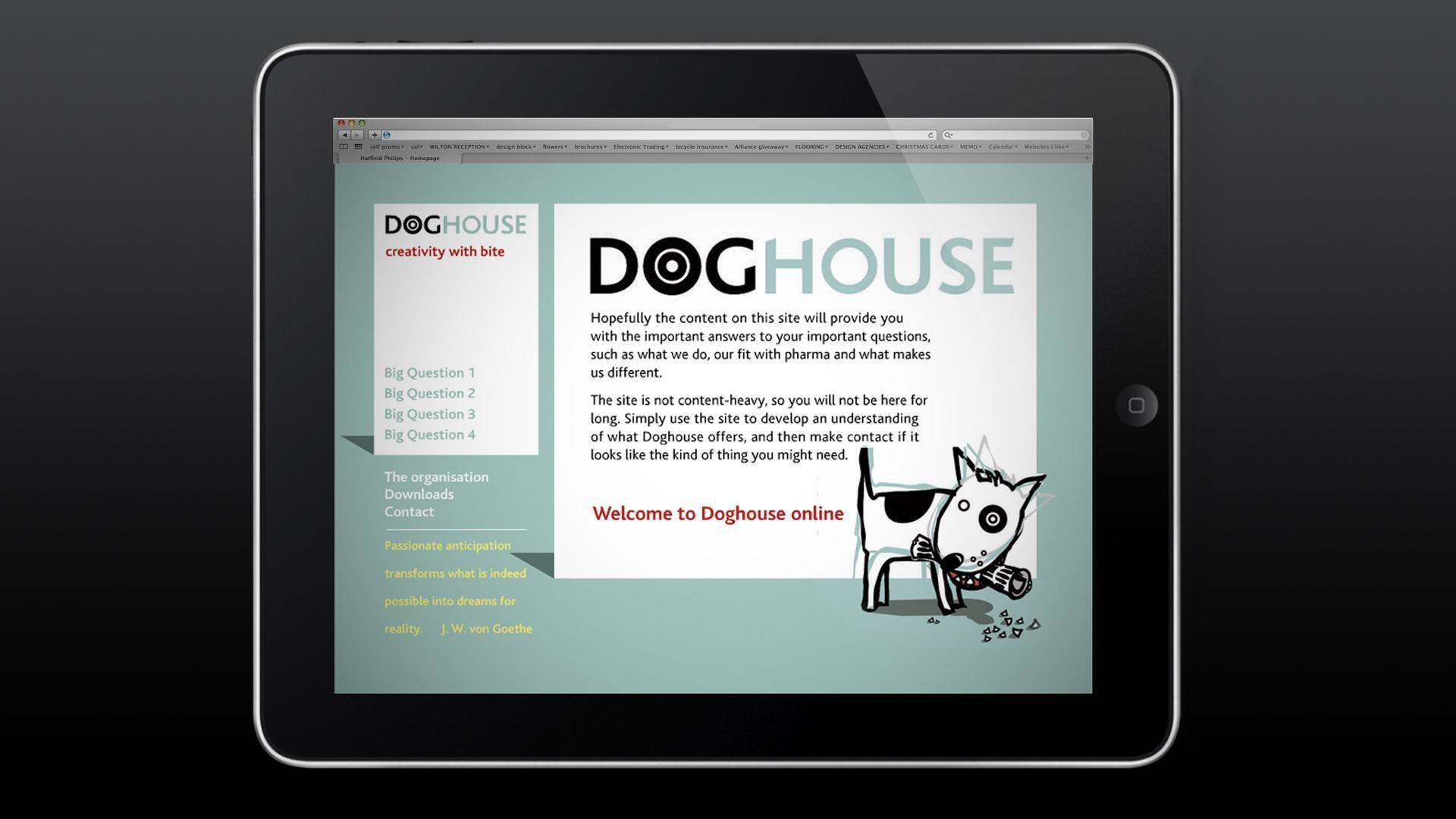
Taking the brand online, the website used the dog icon as a guide around the website.
Its graphic approach lending itself well to dynamic animation.