Brand development
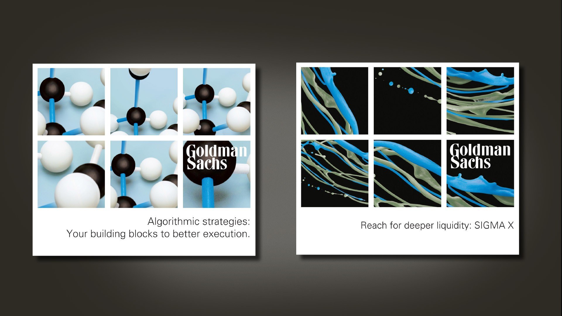
Goldman Sachs Electronic Trading needed a new visual identity that not only sat within the International group brand guidelines, but also stood out from their competitors with a personality of their own.
We created and implemented a creative theme that delivered on both of these parameters:
The core concept of the new visual approach was that of Goldman Sachs being ‘hard wired’ within
the global trading network, and able to connect trader and trades efficiently and effectively.
The visual theme of embedded blue allowed the visuals to reflect products whilst being consistently recognisable as Goldman Sachs Electronic Trading.
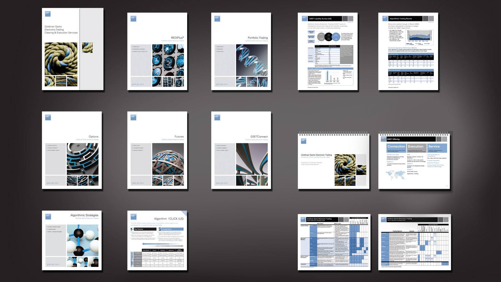
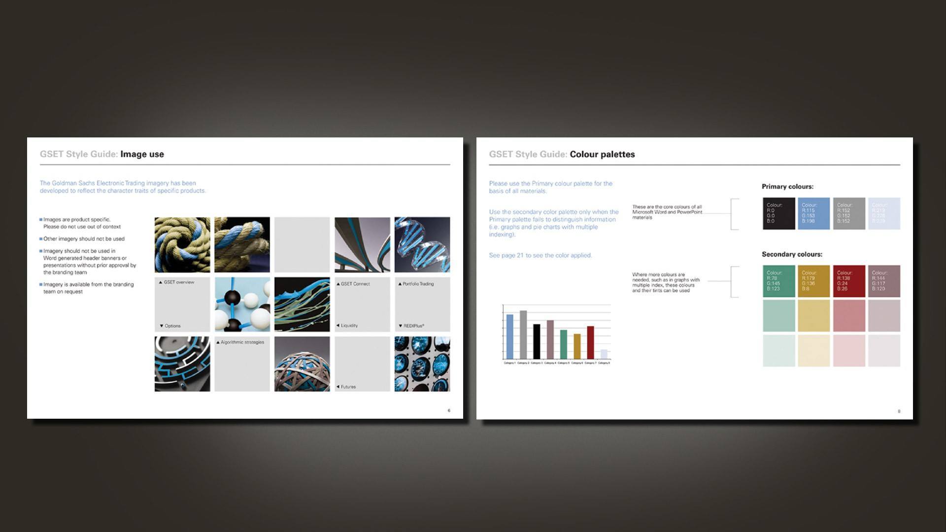
Once the visual identity was established, we expanded the new look to both external literature and templates that could be easily updated in-house – and to maintain the standard of materials, we created a corporate style guide that both introduced the identity and outlined how to create materials.
Following the initial materials, we created a bespoke 6 x 2 metre exhibition stand
that took the visual identity to three dimensions. The stand used design and materials sympathetic to the new visual direction and included a bespoke audio visual loop.


